drhutools
: Political Science
Academic Research GearsThe drhutools
package is designed to support political
science research and academic tasks by providing a set of practical
tools. The functions are developed to streamline routine data analysis
and visualization while accommodating domain-specific requirements.
You can install the stable version of drhutools
from
CRAN or the developed version from GitHub using the following
commands:
folderSystem
A well-organized folder system enhances research efficiency and
ensures continuity, allowing you to easily resume work at any stage of
the project. The folderSystem
function establishes a
standardized folder structure tailored for research projects,
particularly those involving empirical studies in social science.
When the function is executed, it creates the following folder structure in the working directory. Each folder includes a brief guide explaining its recommended usage. Users may delete these instructional files once they have organized their actual project files. If folders with the same names already exist in the directory, the function will not recreate or overwrite them, ensuring no accidental loss of existing data.
## +- paper
## | |
## | +- submission
## | | |
## | | `- files for submission here; delete this file after locating the real files here.txt
## | |
## | `- images
## | |
## | `- non-code-generated images here; delete this file after locating the real files.txt
## |
## +- output
## | |
## | `- image, results, and other output files here; delete this file after locating the real files here.txt
## |
## +- document
## | |
## | `- documents and materials here; delete this file after locating the real files.txt
## |
## +- data
## | |
## | `- all data file here.csv
## |
## `- codes
## |
## `- put codes here; delete this file after locating the real files.txt
cdplot
cdplot
enables the comparison of empirical cumulative
distribution functions (ECDFs) between treatment and control groups in
experiments or quasi-experiments. Unlike conventional bar plots or
difference-in-mean statistics, ECDFs provide a comprehensive,
non-parametric view of differences between the treatment and control
groups, capturing the entire distribution of outcomes.
The function generates a ggplot
object that
displays:
Before using cdplot
, the users should organize the
experimental data in a “long” format, where the first column contains
the outcome variable. The second column contains the group assignment,
stored as a factor with levels. The first level is treated as the
control group.
## [[1]]
##
## [[2]]
##
## [[3]]
Users can customize the appearance of the plot by adjusting: -
point_size
to control the size of the points. -
point_color
to define the color of the points. -
link_color
to set the color of the dashed lines.
Additionally, the function can perform and display the results of a
Kolmogorov-Smirnov (K-S) test to compare the distributions. Set the
ks_test
argument to TRUE
to show the test
result in the bottom-right corner of the plot.
While everyone has their preferred colors, this package includes a
palette that I personally use and recommend. The primary colors are gold
(#FFCD00
) and black (#000000
), which inspired
the name _gb
.
This palette integrates seamlessly with ggplot2
visualizations, allowing users to apply it as they would any other
palette. The visualizations shown above were created using this palette.
Below is an additional example demonstrating how to use it in
practice:
In addition to the primary palette (main
), the package
offers four alternatives to suit various visualization needs:
tricol
: A gradient effect using gold, black, and dark
grey.digitMixed
: A set of five colors optimized for digital
publications.printMixed
: A set of five colors optimized for printed
materials.full
: A comprehensive palette containing all colors
available through gb_cols
.I also invite users to contribute their favorite palettes. You can customize and add your own palette by assigning it a unique name and providing a list of colors.
goodmap
Drawing maps can often be a challenge for Chinese scholars. The
goodmap
function simplifies this process by creating
national maps based on a template provided by Amap.com. This
function is inspired by Dawei Lang’s excellent package leafletCN
and optimizes leafletCN::geojsonMap
to focus specifically
on national maps. It also incorporates geodata updated in 2020 by Yang Cao (details
here).
The current version of goodmap
allows users to draw
points or fill polygons based on the full names of prefectures or
provinces. Here is an example workflow for generating such maps.
To draw a polygon map, the dataset should be formatted with full city
or provincial names. If your data lacks this format, tools such as regioncodes
can help convert the data. The data structure should resemble the
example below (toy_poly
):1
With properly structured data, users can easily generate a national map of China at the provincial or prefectural level:2
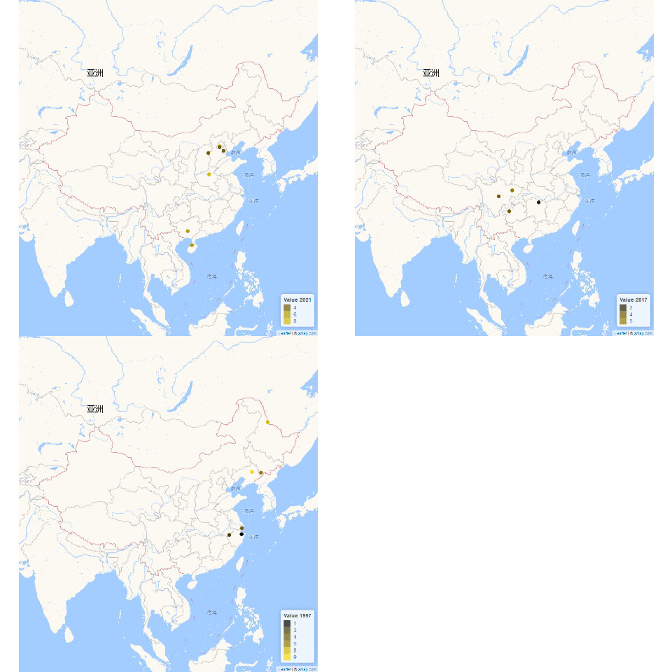
To create a map with points, set type = "point"
. The
data should follow this structure:
toy_point <- data.frame(
g_lat = c(
39.947298,
39.830932,
39.159621,
38.745234,
34.705527,
23.090849,
20.008295,
31.564526,
29.153561,
30.368317,
27.302689,
41.850161,
41.7295,
49.977569,
31.220653,
29.962122,
29.865772
),
g_lon = c(
116.322434,
116.20602,
117.196032,
113.58242,
113.755818,
108.685362,
109.715334,
105.974878,
112.248827,
102.811716,
105.28199,
123.801936,
125.962291,
127.493741,
121.47536,
121.349437,
118.436866
),
value_set = c(8, 4, 4, 4, 8, 6, 6, 5, 2, 4, 4, 9, 5, 8, 4, 1, 3)
)
The g_lat
and g_lon
columns define the
latitude and longitude of the points, while the value_set
column contains the variable to be displayed. If value_set
contains discrete variables, set color_type = "factor"
. The
legend can be named using the legend_name
argument.
goodmap
can also create animations to illustrate
geographic dynamics over time. To do this, set
animate = TRUE
and specify the time variable. Here is an
example:
toy_point$year <- c(
2021,
2021,
2021,
2021,
2021,
2021,
2021,
2017,
2017,
2017,
2017,
1997,
1997,
1997,
1997,
1997,
1997
)
goodmap(
toy_point,
type = "point",
color_type = "factor",
animate = TRUE,
animate_var = "year"
)
Currently, animated plots are stored in a temporary file. If satisfied with the result, users should save the animation to a desired location before rerunning the function.
traits
The traits
function calculates personality trait scores
based on psychological survey responses. The current version supports
scoring for two widely used scales:
To use traits
, the survey data must include specific
column names corresponding to the questions in each scale:
Q3|R3
through
Q13|R4
.Q14|1
through
Q25|1
.The following example demonstrates how to prepare and analyze a
dataset using traits
:
column_names <- c(
"Q3|R3", "Q3|R4", "Q4|R3", "Q4|R4", "Q5|R5", "Q5|R6", "Q6|R3", "Q6|R4", "Q7|R3",
"Q7|R4", "Q8|R5", "Q8|R6", "Q9|R5", "Q9|R6", "Q10|R5", "Q10|R6", "Q11|R5", "Q11|R6", "Q12|R3",
"Q12|R4", "Q13|R3", "Q13|R4", "Q14|1", "Q15|1", "Q16|1", "Q17|1", "Q18|1", "Q19|1", "Q20|1",
"Q21|1", "Q22|1", "Q23|1", "Q24|1", "Q25|1"
)
toy_data <- data.frame(matrix(sample(1:5, 10 * length(column_names), replace = TRUE),
ncol = length(column_names)
))
names(toy_data) <- column_names
traits(toy_data)
## score_shame score_guilt score_grit
## 1 36 36 2.166667
## 2 36 28 2.500000
## 3 33 33 2.916667
## 4 27 30 2.583333
## 5 25 39 3.000000
## 6 34 37 3.916667
## 7 24 32 3.000000
## 8 37 32 2.583333
## 9 36 33 4.083333
## 10 40 37 3.000000
This example generates random data for the required columns and calculates the scores for TOSCA-3SC and Grit-O. Adjust your dataset to match the column structure and format for accurate scoring.
Yue Hu
Department of Political Science,
Tsinghua University,
Email: yuehu@tsinghua.edu.cn
Website: https://www.drhuyue.site
Wen Deng
College of Public Administration,
Huazhong University of Science and Technology,
Email: dengwenjoy@outlook.com
CRAN check seems not allow Chinese characters in the
vignette since it intends to compile a pdf version. To pass the CRAN
check, I had to insert a screenshot as following rather than the real
toy data. For users who want to try the toy data, you can find the codes
to create it in the example of goodmap
.↩︎
If errors occur or the output is unreadable, adjusting the encoding may resolve the issue.↩︎