
This package provides the implementation of the radar-boxplot, a chart created and developed by the author.
The package is available in the CRAN repository.
install.packages("radarBoxplot")There are two variants Default and Formula
that accepts two different sets of arguments as input.
x: numerical data frame or matrix of quantitative
variables/ordinal categorical variables.y: vector of labels/factorsx: formula describing the relationship between the
categorical target variable and the descriptive numerical
variables.data: the data frame which the formula refers to.IQR: numeric. The factor to multiply the IQR to define
the outlier threshold. Default 1.5use.ggplot2: if ggplot2 is available it will use ggplot
for plotting: Default FALSEmfrow: mfrow argument for defining the subplots nrows
and ncols: Default will calculate the minimum squareoma: outer margins of the subplots: Default c(5,4,0,0)
+ 0.1mar: margins of the subplots: Default c(0,0,1,1) +
0.1innerPolygon: a list of optional arguments to override
Q2-Q3 graphics::polygon() style: Default list()outerPolygon: a list of optional arguments to override
the outer (range) graphics::polygon() default style:
Default list()innerBorder: a list of optional arguments to override
the inner border graphics::lines() default style: Default
list()outerBorder: a list of optional arguments to override
the outer border graphics::lines() default style: Default
list()medianLine: a list of optional arguments to override
the median line graphics::lines() default style: Default
list()outlierPoints: a list of optional arguments to override
the outliers graphics::points() default style: Default
list()nTicks: number of ticks for the radar chart: Default
4ticksArgs: a list of optional arguments to override
radar ticks graphics::lines() default style: Default
list()axisArgs: a list of optional arguments to override
radar axis graphics::lines() default style: Default
list()labelsArgs: a list of optional arguments to override
labels graphics::text() default style: Default list()angleOffset: offset for rotating the plots: Default
will let the top free of axis to avoid its label overlapping the
titleThe radar-boxplot merges the concepts of both radar chart and the boxplot, allowing to compare multivariate data for multiple classes/clusters at the same time. It provides an intuitive understanding over the data by creating radar polygons which can be compared in terms of shape and thickness, giving a meaningful insight towards identifying high inner variation and similar classes/clusters.
By interpreting the radar-boxplot, it is possible to predict classification confusion over classes and understand why and what could be done to achieve better results.
The plot consists of a polar plot with radius 1. The circunference is
divided into n axes, where n is the number of
attributes which will be represented, one for each axis. The attributes
are normalized to range from 0.1-1.0 to avoid overlapping low values in
the center of the plot. The normalization is done through
normalized = (X - min) / (max - min), then it is
transformed to 0.1-1.0 range through
rescaled_norm = (normalized * 0.9) + 0.1.
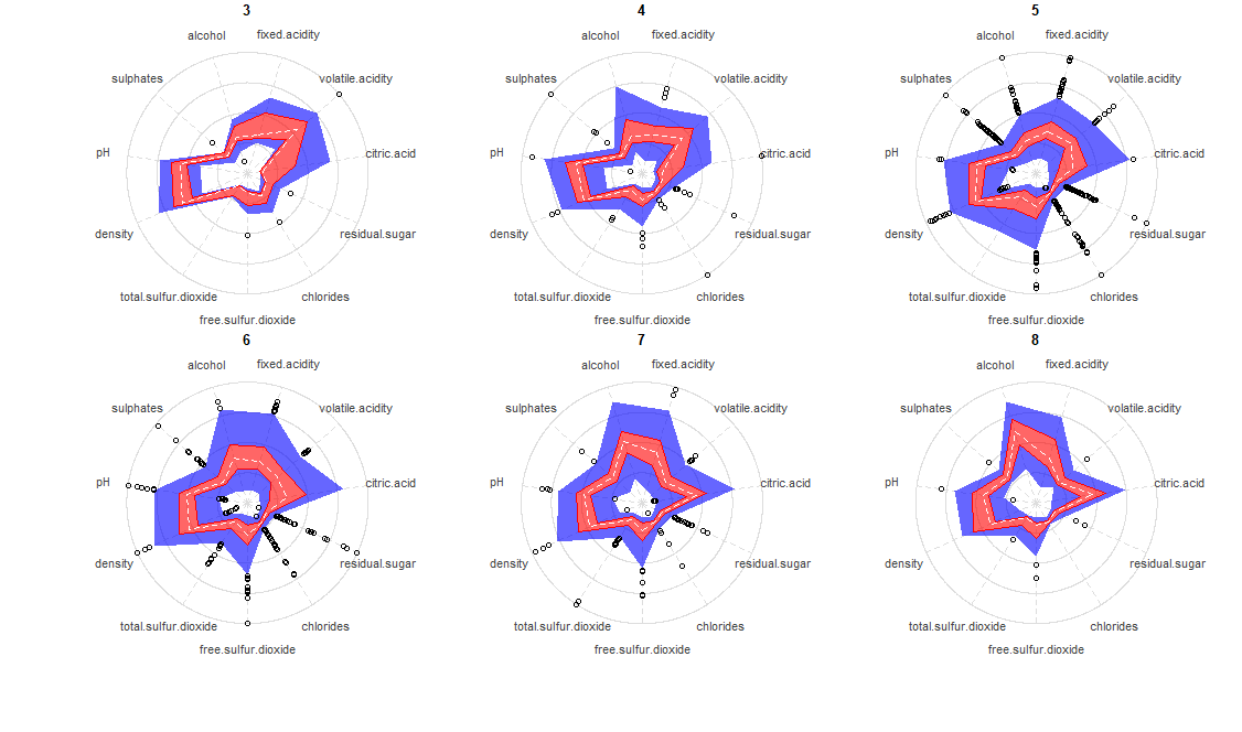
The radar-boxplot draws two different colored regions representing the same a boxplot would, but for multiple attributes at once. The inner red region represents the 25-75% percentiles of each attribute, while the blue area represents the total range, excluding the outliers as defined by Tukey (1977). Outliers appears as points, just like the classic boxplot and are defined with the formulas:
IQR = Q3 - Q1
LOWER_OUTLIER = Q1 - (1.5 x IQR)
UPPER_OUTLIER
= Q3 + (1.5 x IQR)
The following shows an example of the radar-boxplot over the Wine Quality Dataset (Cortez et al., 2009).

As the rating gets higher there are two different things happening. First, there is a shift on the overall shape, mainly getting a more defined “pointy” shape towards citric acid and alcohol, while concave for volatile acidity. The second interesting fact is that the inner variation appears to reduce, suggesting that top quality wines must conform to a stricter set of parameters, while intermediante ones can have a mixture of poor properties along with high quality ones compensating each other. I could also propose a cluster analysis within ratings 5 and 6 (because of the high inner variation) to try to understand if there are multiple patterns within them, which could reveal different sets of intermediate wines.
The radar-boxplot is best suited for when there are more than 4 relevant variables for your clustering/classification task, because it gives the possibility to represent higher dimensionality while still being readable.
library(radarBoxplot)
data("winequality_red")

# Regular
radarBoxplot(quality ~ ., winequality_red)

# Orange and green pattern with white median
orange = "#FFA500CC"
green = rgb(0, .7, 0, 0.6)
radarBoxplot(quality ~ ., winequality_red,
             use.ggplot2=FALSE, medianLine=list(col="white"),
             innerPolygon=list(col=orange),
             outerPolygon=list(col=green))


# Plot in 2 rows and 3 columns
# change columns order (clockwise)
radarBoxplot(quality ~ volatile.acidity + citric.acid +
             residual.sugar + fixed.acidity + chlorides +
             free.sulfur.dioxide + total.sulfur.dioxide +
             density + pH + sulphates + alcohol,
             data = winequality_red,
mfrow=c(2,3))Thanks Dr. Michael Friendly for your great suggestions for improving this package, I’m still working on those. Also, I’d like to thank Dr. Peter Rousseeuw for his valuable feedback.